
Home Page, Sign-Up & OnboardingInfobip · 2021 · ~3 months |
 |
| Senior Product Designer (given free rein to lead end to end) · my first project at Infobip · with the Growth team, per-channel PMs, engineers & researchers |
In short: Infobip showed a single generic homepage to every free-trial user, made no attempt to derive intent, and left people to navigate a huge product portfolio alone — bounce was high and conversion abysmal. I replaced it with an intent-driven personalisation model: 8 tailored homepages (SMS, Email, WhatsApp, Viber × developer vs business user), each focused on one ‘aha’ moment — sending and receiving a test message. I mapped golden-path activation journeys, revamped sign-up with a 2-step intent prequalifier, and added an “invite colleagues” lever. Conversions rose and bounce dropped, with SMS and WhatsApp strongest. This project seeded the intent-based thinking later applied in the Moments Onboarding Redesign.
The problem
Infobip offered a free trial across all of its CPaaS and SaaS product offerings — but presented a single, generic homepage to every user, regardless of who they were or what they’d come to do. The platform made no attempt to derive a user’s intent; instead it left people to explore the full complexity of the product portfolio on their own. New trial users couldn’t understand the value and got lost navigating a complex product, with the burden of “what do I do, and how?” falling entirely on them.
A single generic homepage for everyone — high bounce, poor onboarding-step conversion, and poor free-trial→paid conversion.
Help-form feedback surfaced a multitude of concrete problems too — including messages not being sent and an inability to register a sender: real functional blockers, not just UX friction.
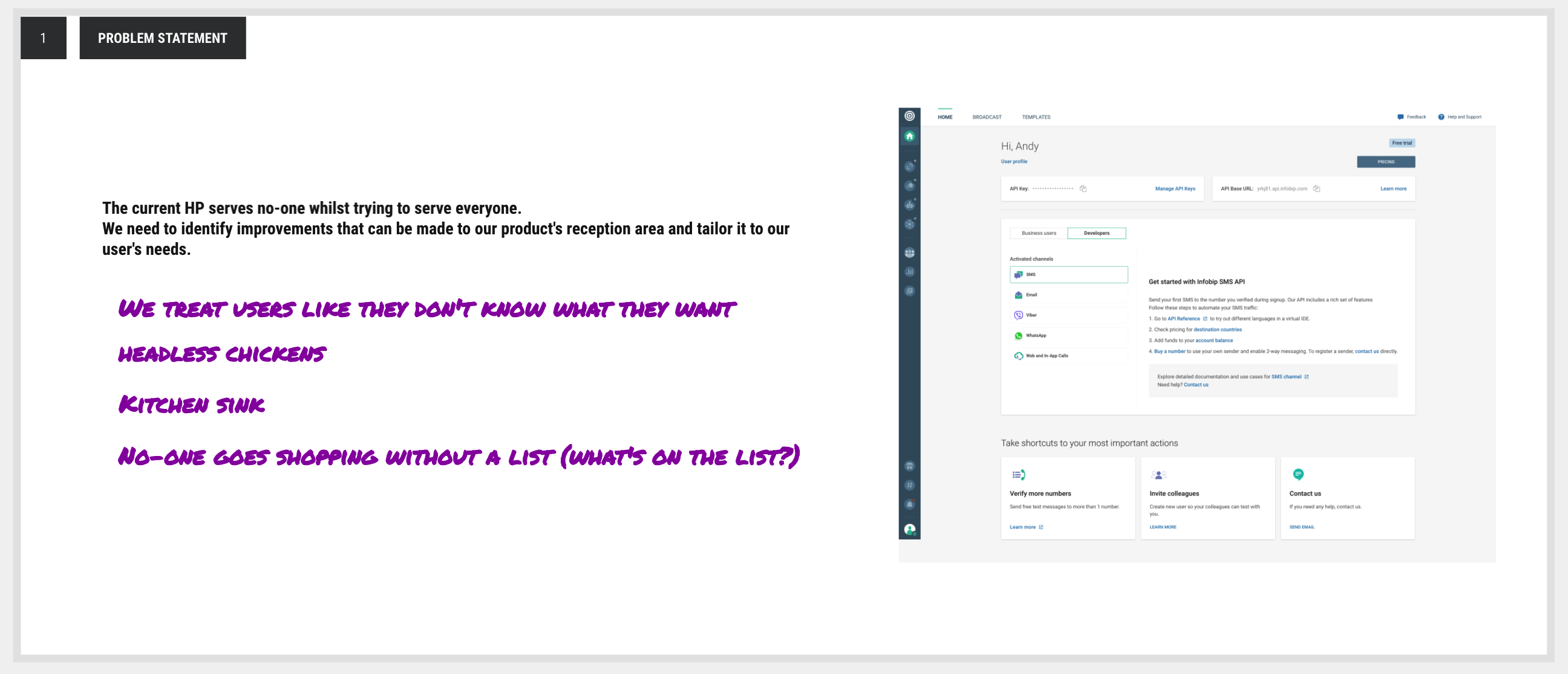
Problem statement — the homepage “serves no-one whilst trying to serve everyone”: we were treating users like they didn’t know what they wanted, and throwing the whole kitchen sink at them.
To frame the work, I ran a simple exercise contrasting what a homepage is expected to feel like with what ours had become in reality.
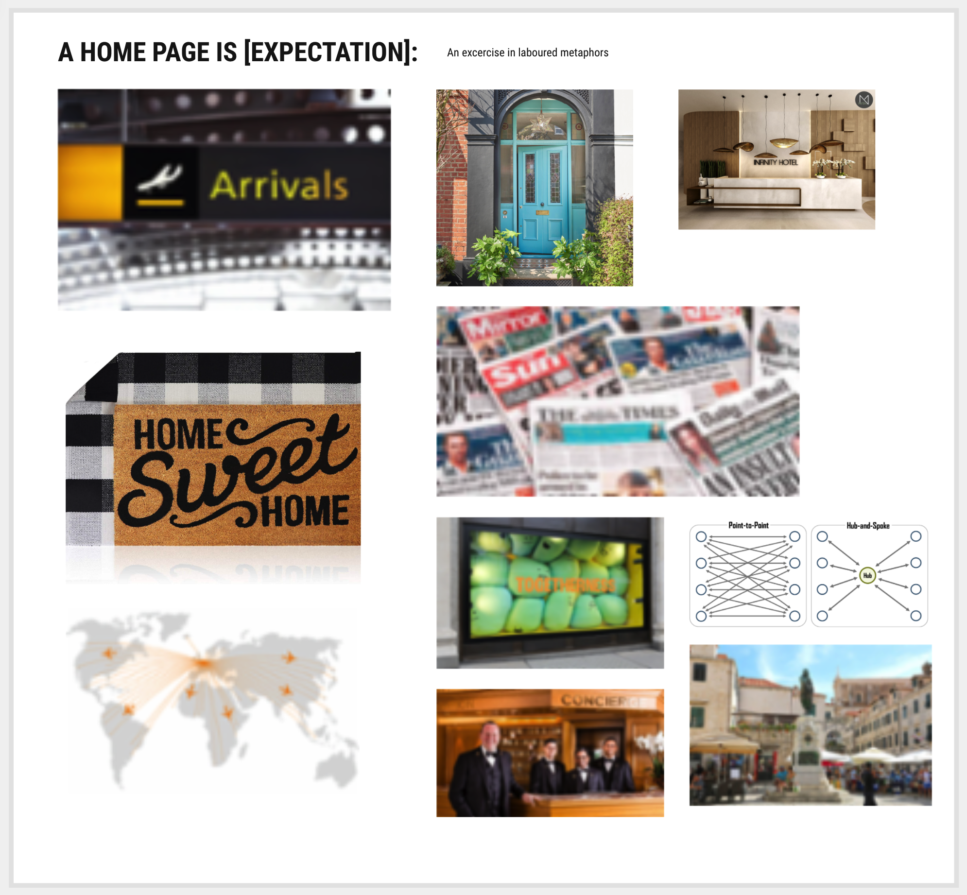
A home page is [expectation] — an arrivals board, a welcoming front door, a concierge who points you the right way.
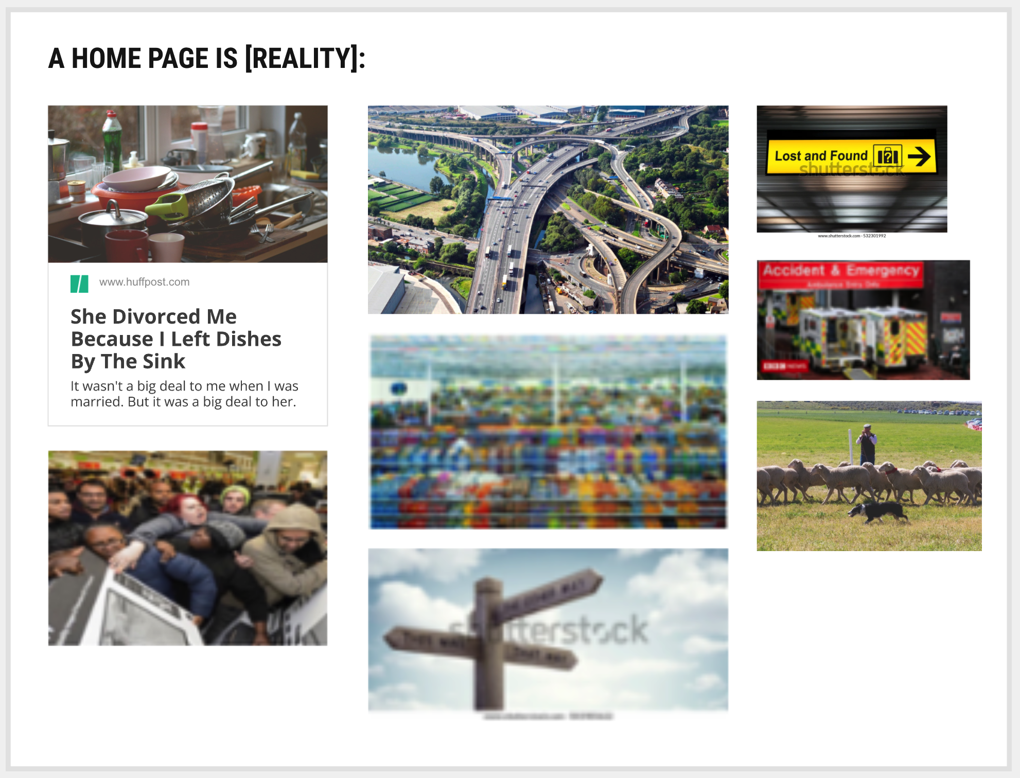
…and a home page is [reality] — a cluttered sink, a tangled motorway junction, lost-and-found, A&E. The gap was the brief.
Discovery & research
- Internal stakeholder interviews — typically the PM responsible for each message type/channel, to understand their expectations for onboarding and activation.
- Analytics deep-dive — analysed user paths, watched session replays, and reviewed portal feedback to locate where users stalled.
- Collaborative workshops — ran ideation and affinity-mapping sessions to separate what all users need from what portal-only and API-only users need.
- Competitive analysis of rival CPaaS homepages, and a client survey to validate the problem with real trial users.
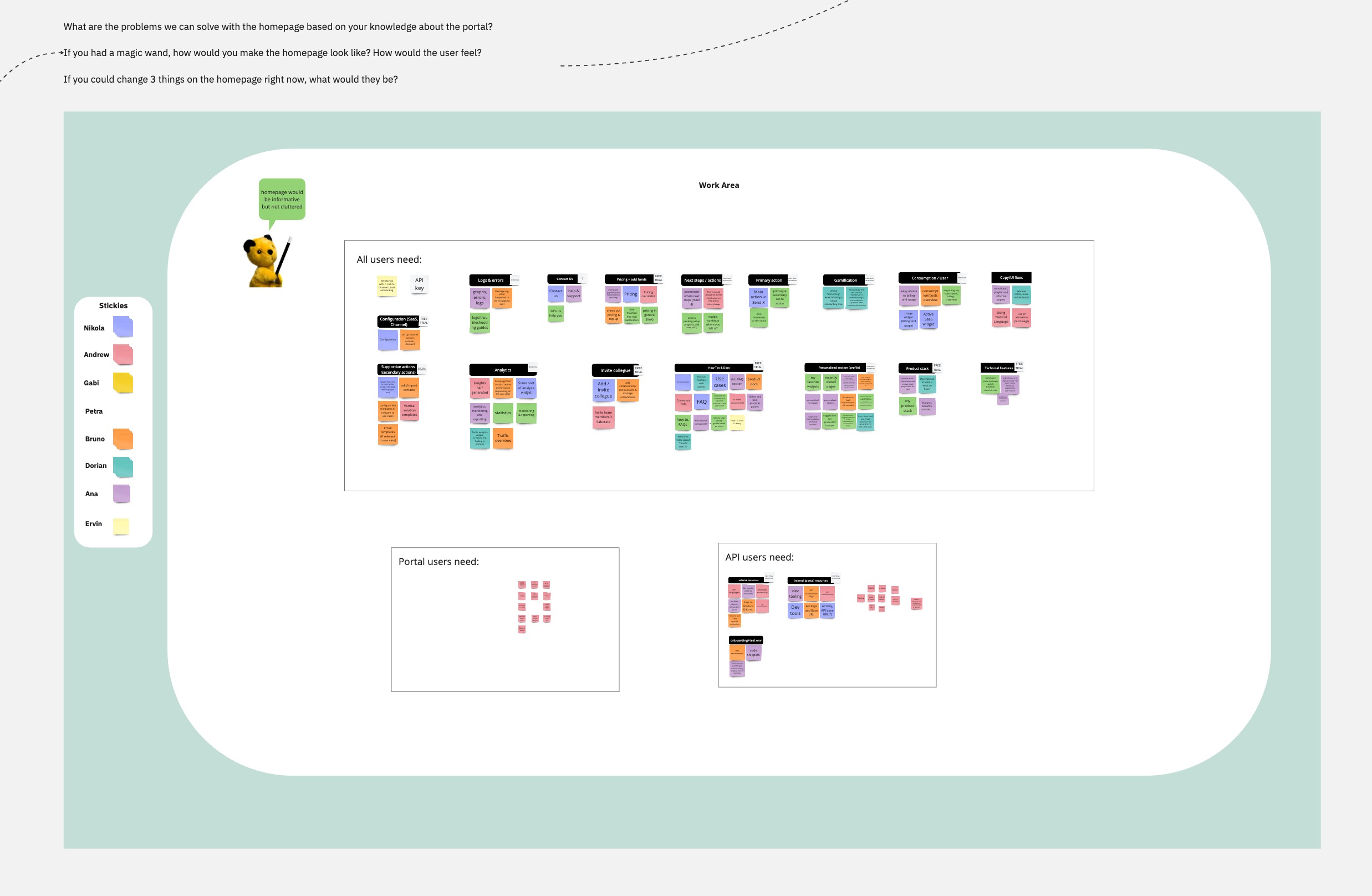
Affinity-mapping workshop — clustering needs into “all users”, “portal users” and “API users” to find the common core and the divergences.
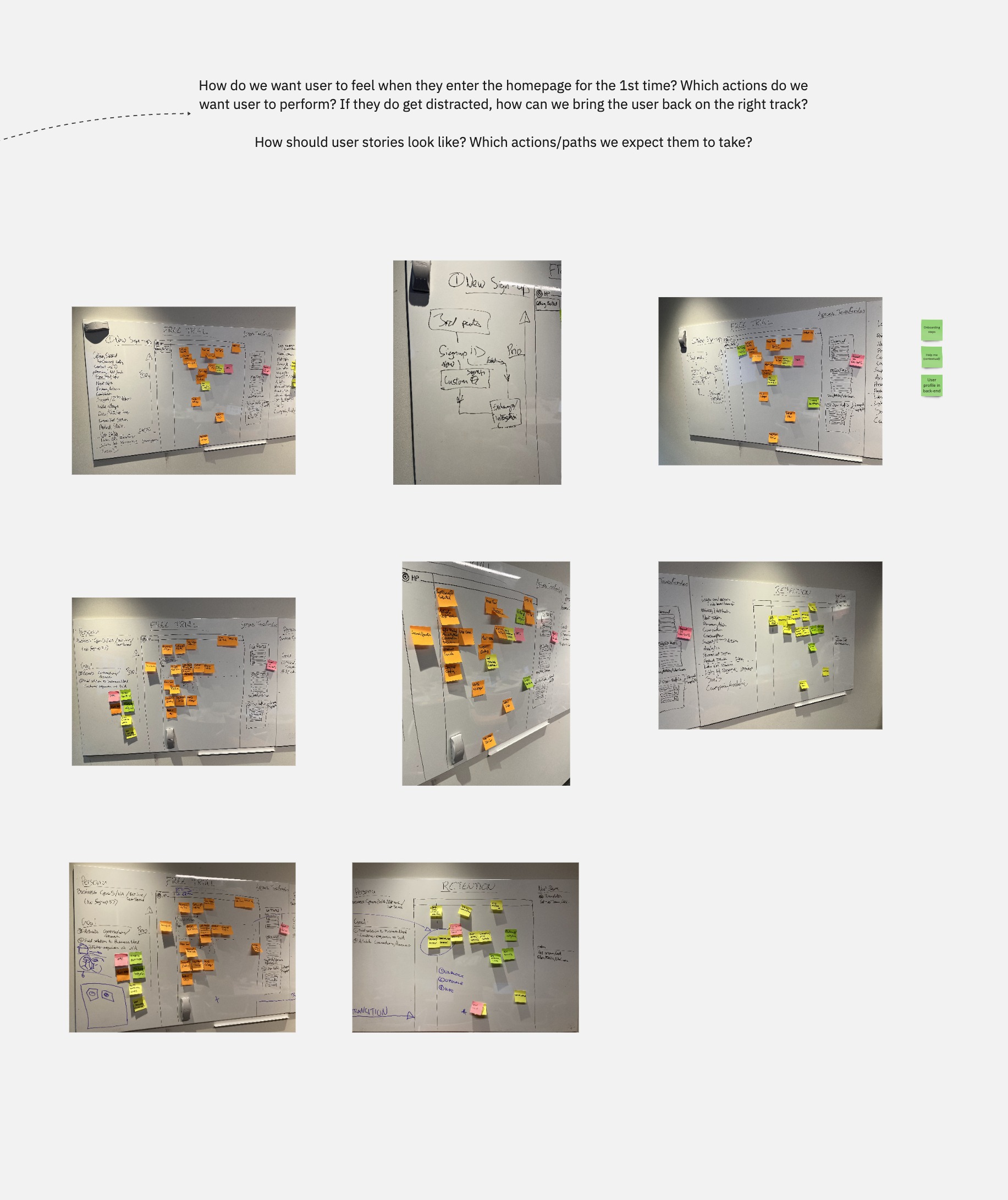
User-story mapping — how should users feel entering the homepage for the first time, and which paths do we expect them to take?
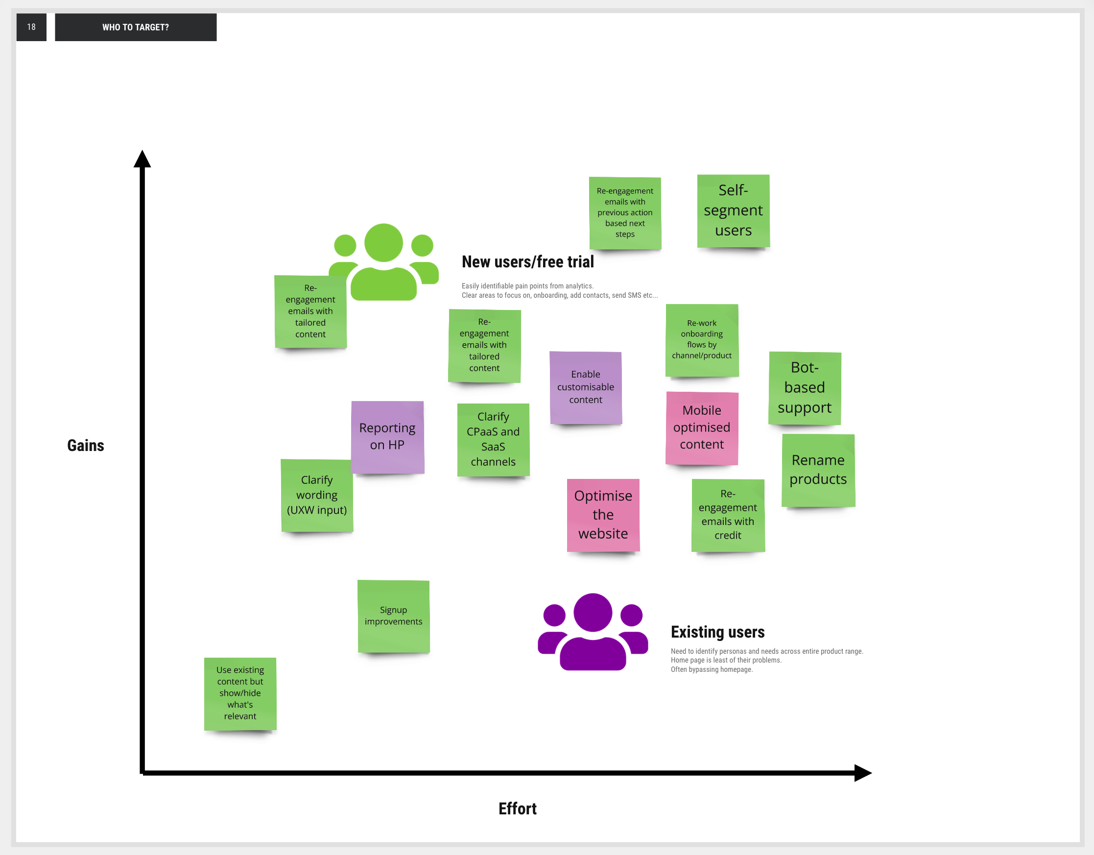
A gains-vs-effort matrix to decide who to target — prioritising new/free-trial users over existing users for the first release.
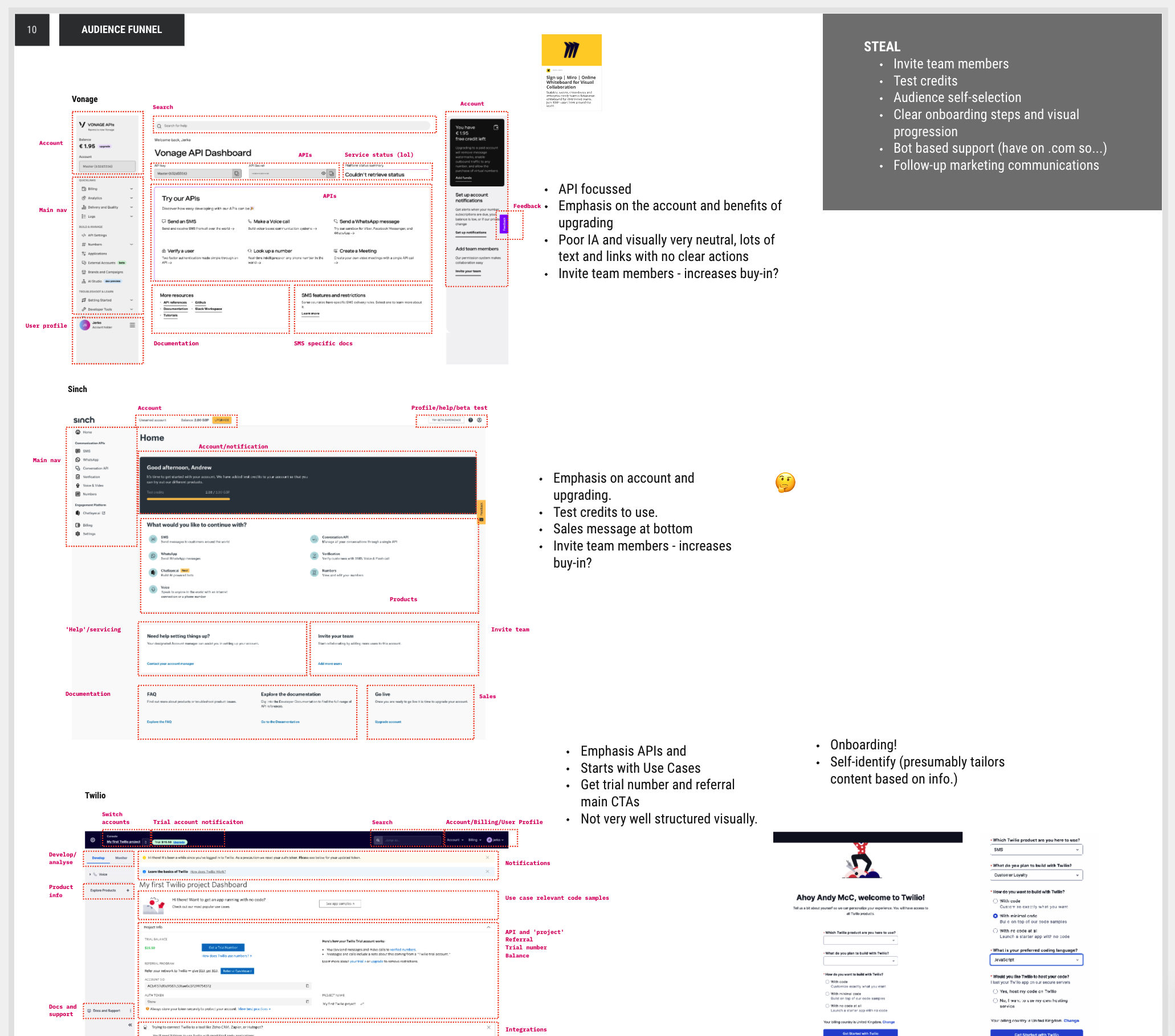
Competitive analysis of rival CPaaS homepages (Vonage, Sinch, Twilio) — stealing the best patterns: audience self-selection, test credits, invite-team, clear onboarding progression.
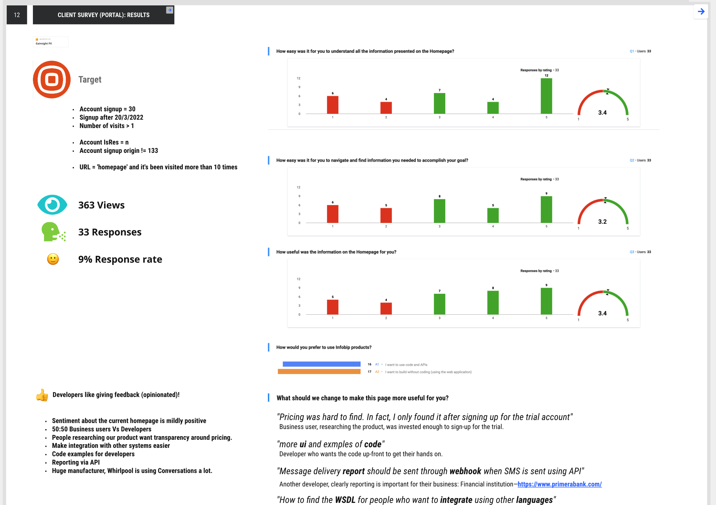
Client survey of real trial users — 363 views, 33 responses, and verbatim feedback that grounded the redesign in genuine user pain.
The solution
The redesign replaced the one-size-fits-all homepage with a personalised, intent-driven set of experiences, built around getting users to value fast.
- Four channel-specific homepages for the key revenue-driving CPaaS channels — SMS, Email, WhatsApp and Viber — each focused on a handful of onboarding steps to reach the ‘aha’ moment.
- Two audience variants of each homepage — one for developers, one for business users — so content and path matched how each audience thinks and works. (4 channels × 2 audiences = 8 tailored homepages.)
- Golden-path journeys to activation — mapped the ideal route to activation per channel, so the design had a clear target rather than open-ended exploration.
- A revamped sign-up with a 2-step prequalifier questionnaire to capture the user’s intent and persona up front — the mechanism that made downstream personalisation possible.
- An “invite colleagues” button on the homepage, on the insight that these products are used by teams, not single users — more colleagues engaging means a higher likelihood of conversion. A deliberate, low-cost growth lever.
The single target: get the user to send a test message — and receive it on their own device.
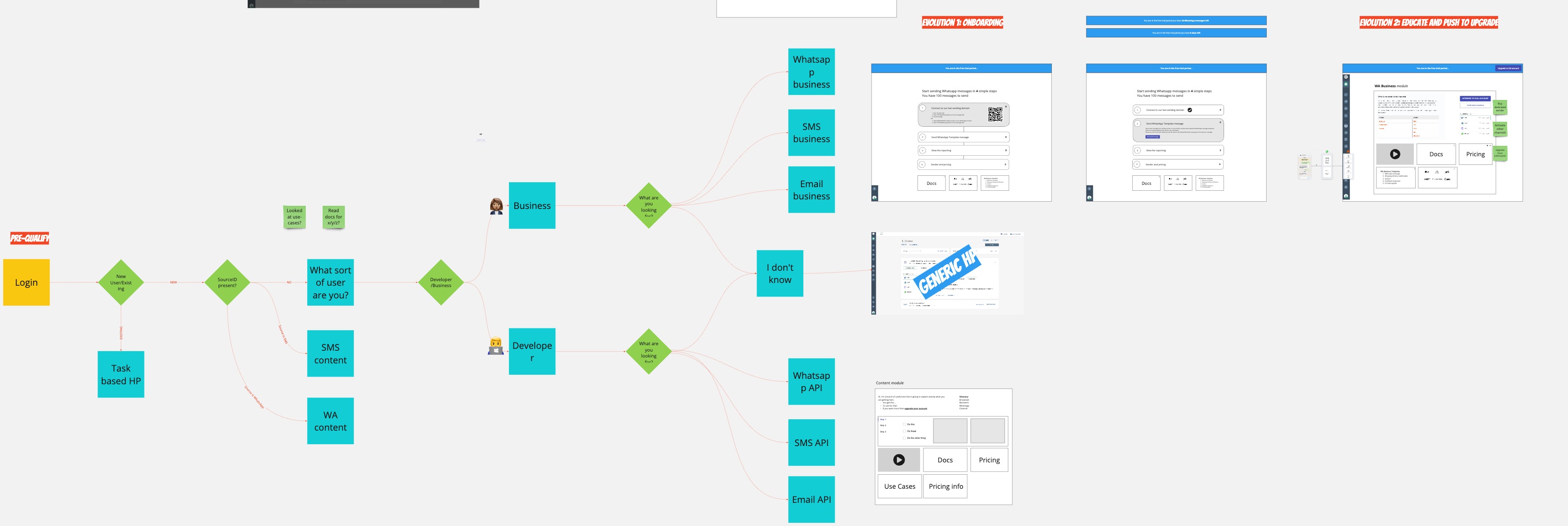
The intent-routing logic — from login through source/persona/channel to a channel-specific “golden path” toward activation.
The prequalifier itself was a deliberate design decision. I workshopped its format with the team — single vs multi-select, skippable or not — weighing better intent data against added sign-up friction.
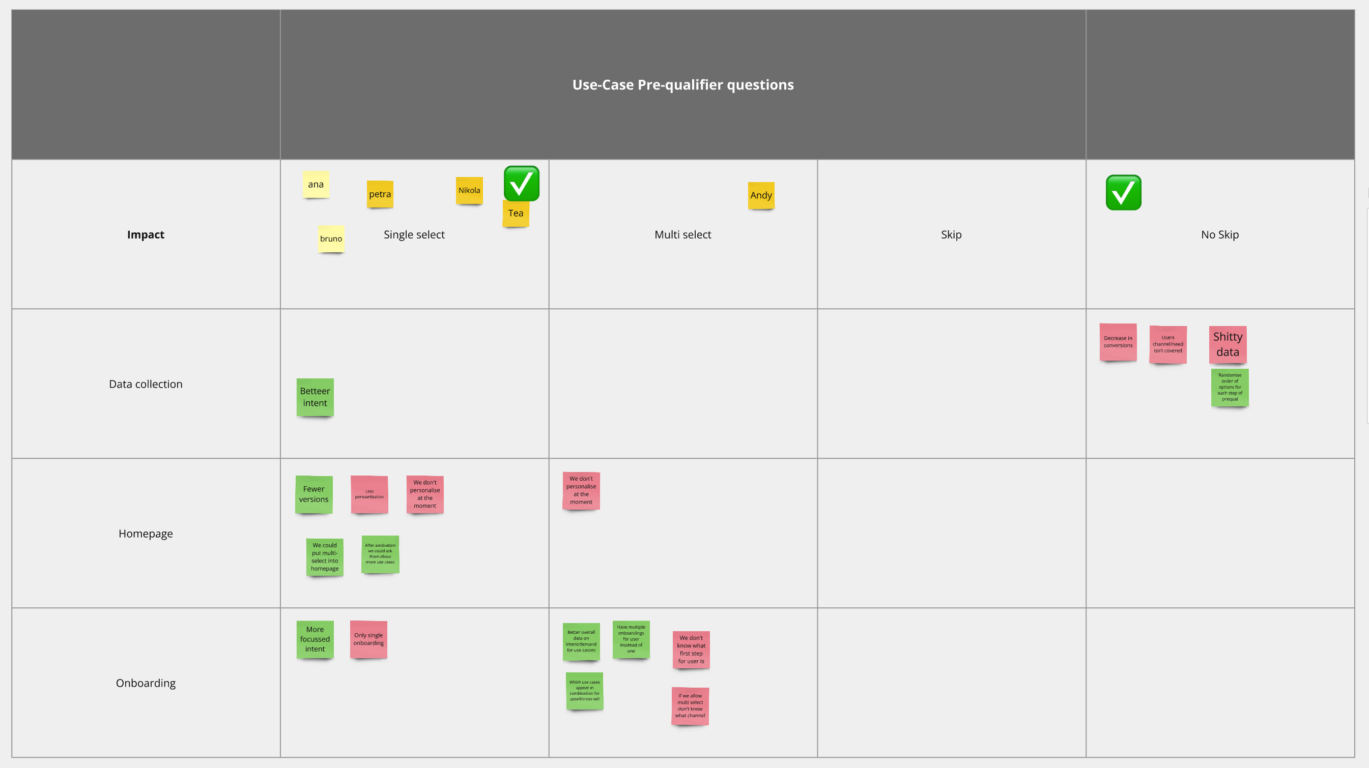
Deciding the prequalifier’s mechanics with the team — single-select and no-skip won, for cleaner intent data and simpler downstream personalisation.
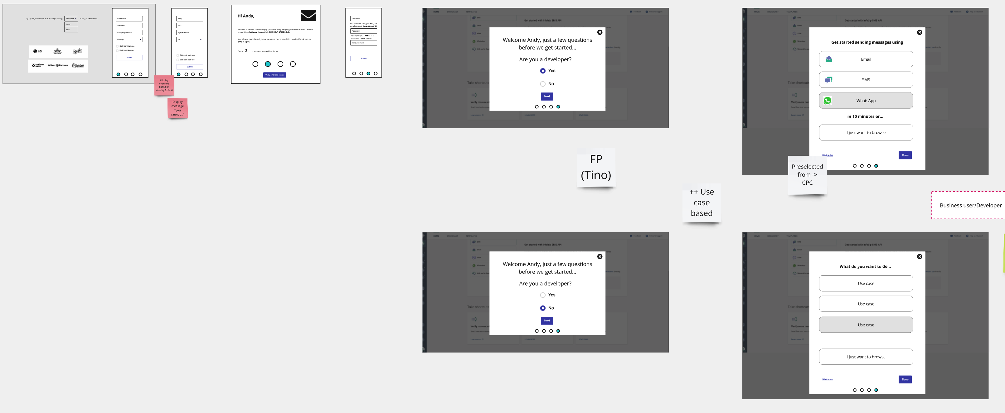
The 2-step prequalifier flow — a couple of quick questions (developer or business? which channel? what for?) that route the user into the right homepage.
Those signals fed directly into the final, personalised homepage — here in high fidelity for a WhatsApp user, built around a handful of steps to a first send.
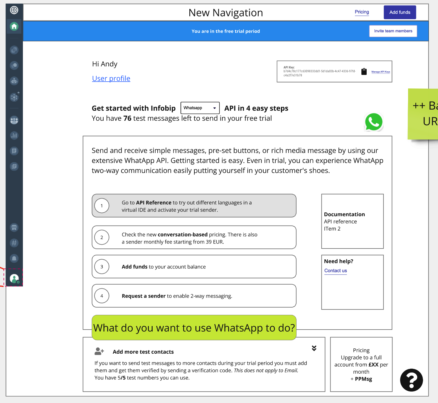
Final high-fidelity homepage — “API in 4 easy steps”, personalised to a WhatsApp developer, with a clear test-message allowance.
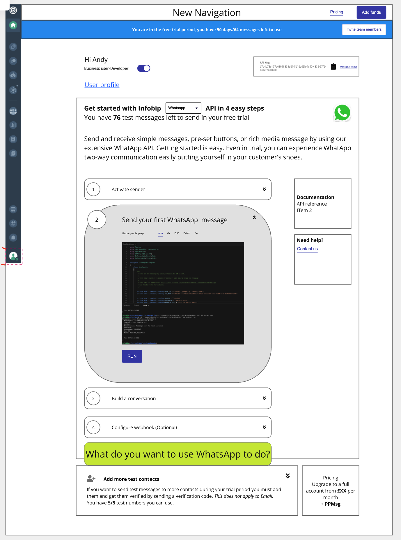
Learning by doing — the “send your first message” step, with a code sample inline, driving straight at the ‘aha’ moment.
The roadmap it set up
The project was designed as the foundation for a larger vision: to further customise the homepage and tailor the onboarding, testing and consumption phases according to the user’s position in the acquisition funnel — so the experience would adapt not just to who the user is (persona/intent) but to where they are in their journey. I mapped this as a series of “evolutions”: onboard & activate → push to upgrade → business-as-usual & upsell.
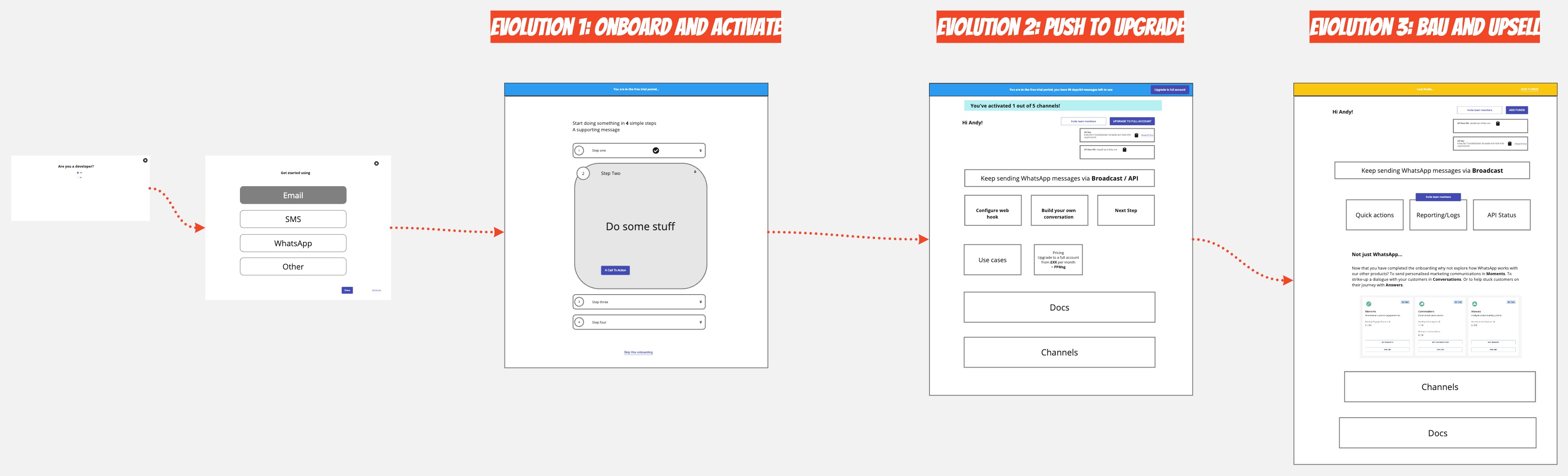
The homepage “evolutions” — the same surface adapting as the user moves through the funnel: onboard & activate, then push to upgrade, then BAU & upsell.
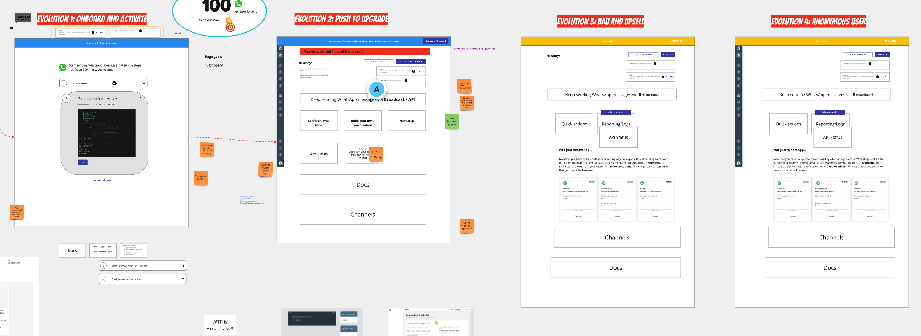
Annotated wireframes working through each evolution stage in detail.
Results & impact
Conversions improved and bounce rate dropped after launch. Precise figures are lost to time (this was 2021), but the direction was clear and positive, and within the team the project was considered a success. SMS and WhatsApp saw a noticeable uptick in particular — unsurprisingly, as they were Infobip’s best-performing channels and the most amenable to a fast self-service ‘aha’ moment. Email was always going to be the hardest to convert self-service, as it requires a sending domain and DNS configuration; recognising that not every channel can be optimised to the same activation curve was part of the product judgement.
Challenges & reflection
- Stakeholder alignment across many channel PMs, each with their own priorities.
- Breadth of the product offering made it genuinely hard to define what a successful onboarding even looked like across so many channels.
- Individual PM needs vs. the needs of all users — the classic tension between local optimisation and a unified product.
- Guiding non-technical users through technical setup — creating and registering senders, and educating users about restrictions such as country-specific SMS rules.
- Frictionless onboarding vs. abuse prevention — a constant battle to keep onboarding smooth while screening out spammers looking to abuse the platform.