
Moments Onboarding RedesignInfobip · 2023 · ~4 months |
 |
| Senior Product Designer (led design) · collaborated with PMs, engineers & researchers; 6+ PMs interviewed |
In short: Infobip’s free trial funnelled users into a complex portfolio with no way to route them to the right product. Through a heuristic walkthrough, 6+ PM interviews, Amplitude analysis and sign-up-source data, I found the key signal hiding in plain sight: a user’s intent could be read from their sign-up source, combined with a short sign-up pre-qualifier. I proposed segmenting users into low- and high-intent journeys with distinct landing pages, a provisioned test user and hands-on test flow, use-case templates, an in-context help panel and an onboarding wayfinder. The project was later de-scoped — but its core ideas, especially the intent-based segmentation model, impressed leadership and were reused across other projects.
The problem
Infobip’s free trial gave new users access to its CPaaS platform and three separate SaaS products (Moments, Conversations, Answers), each with its own free trial. There was no clear way to route a user to the right product for their needs, and the self-service onboarding funnel was performing badly. New users were overwhelmed by too many options and confusingly-named, marketing-driven products, with no clear path through onboarding.
Only 4.55% of free-trial sign-ups went on to launch a flow — just 14 of 50 users who started a flow succeeded.
The evidence was clear: funnels had too many steps; one contained a blocking JavaScript error; and after activating a SaaS trial the portal navigation changed, stranding users on the main homepage with no route back to onboarding.
Discovery & research
I started by experiencing the problem first-hand, then triangulated across qualitative and quantitative sources:
- A heuristic walkthrough of the full end-to-end onboarding, as a user would experience it
- Interviews with 6+ PMs across the key product areas
- An Amplitude deep-dive into user paths and drop-off points
- Sign-up-source analysis — which infobip.com page each user arrived from
- Remote user interviews with internal and external users
- All journeys mapped in Miro, including in-product engagements
Two findings shaped everything that followed. First, intent was hiding in the sign-up source — a strong signal nobody was using. Second, people want to learn by doing, not by watching: a PM wanted to lean on lengthy instructional videos, but interviews showed users overwhelmingly preferred hands-on activation.
The pivotal decision: segment by intent
The single most important decision was to segment users by intent, derived from their sign-up traffic source used in conjunction with a sign-up pre-qualifier questionnaire. Together these two signals split the audience into low-intent users (arrived via general exploration, no clear signal) and high-intent users (arrived from a Moments-related page, already knew roughly what they wanted). This let us design fundamentally different experiences for different needs — and gave the business a realistic, grounded view of the numbers we could actually chase.
The solution
1 · Two intent-based landing pages. The high-intent page focused on activation and time-to-value: a provisioned test user on sign-up, a test flow to learn by doing, and use-case templates. The low-intent page focused on the value proposition — explaining what Moments is and why it matters.
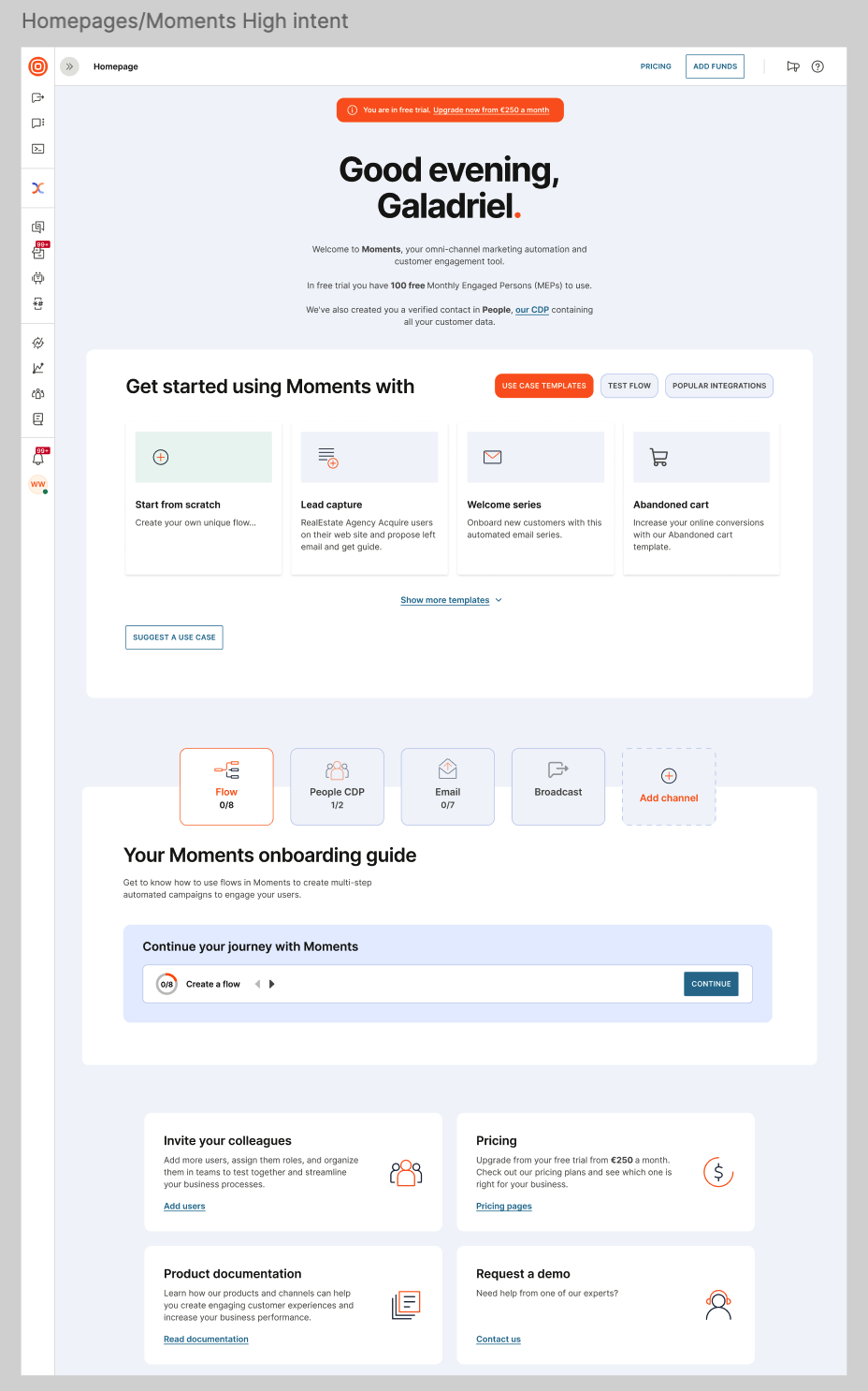
High-intent homepage — activation-first: use-case templates, test flow, and an onboarding guide surfaced immediately.
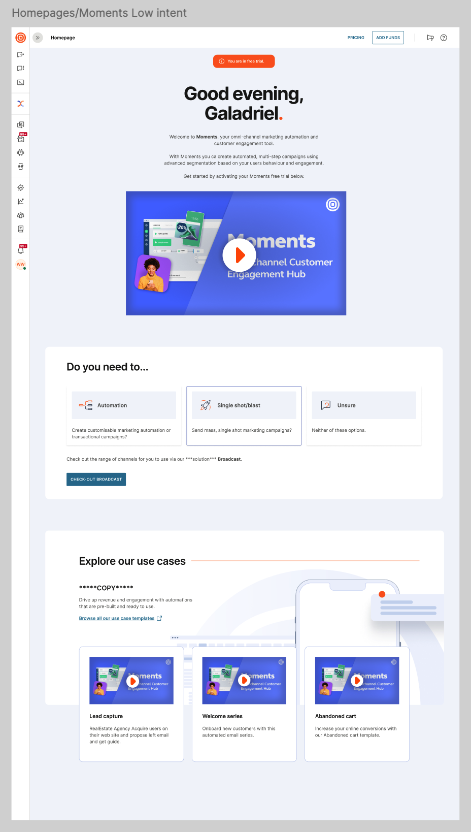
Low-intent homepage — value-proposition-first: explains what Moments is and lets users explore use cases before committing.
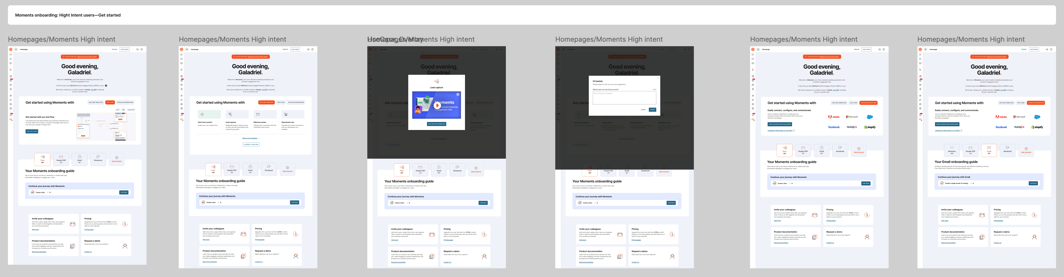
A selection of the high-intent homepage design variants explored.
Capturing intent at sign-up. A short pre-qualifier questionnaire during sign-up captured persona and intent (preferred channel, use case, experience level). Used in conjunction with the sign-up-source signal, the two together determined which experience a user was routed into — the source hinted at intent, and the questionnaire confirmed and sharpened it.

The sign-up pre-qualifier flow — capturing intent and persona before dropping users into the product.
2 · A repurposed help flyout panel. Reworked the existing help flyout to surface more relevant help and information in the correct context, rather than as generic, undifferentiated documentation.
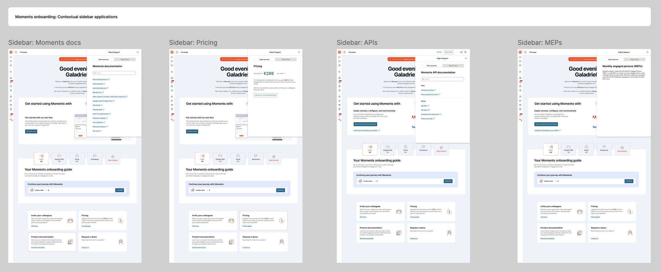
Contextual help sidebar variants — surfacing docs, pricing, APIs and MEP guidance relevant to the user’s current context.
3 · An onboarding wayfinder. A navigational aid to let users move easily between onboarding steps — built specifically as a workaround for a hard technical constraint: we could not alter the portal’s main homepage or redirect users between onboarding steps directly, so the wayfinder gave them a path we could control.
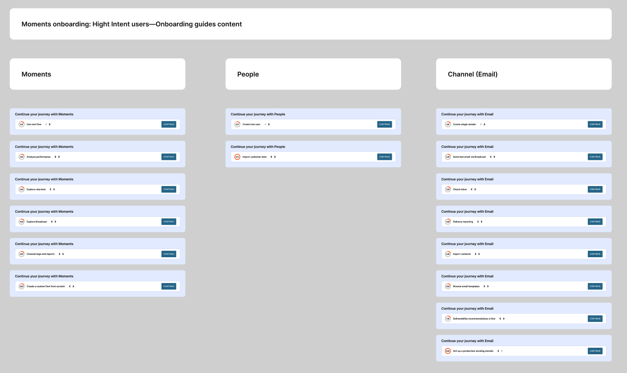
Onboarding-guide content — sequenced “continue your journey” steps grouped by area (Moments, People, Channel).
4 · Fixes & optimisation. Fixed the onboarding guide errors (including the blocking JavaScript error), and identified steps common across products so they could be deprecated and optimised — reducing the overall number of pain points.
Evidence over opinion
The clearest example of research overriding assumption: a PM advocated for lengthy instructional videos, but user interviews showed people overwhelmingly preferred to do rather than be told. The high-intent experience was built around a live provisioned test user and a hands-on test flow instead of a content-heavy walkthrough. To manage stakeholders, I preempted pushback by presenting several solution options at varying levels of engineering effort, then broke the landing-page proposal into a phased delivery plan with engineering.
Outcome & reflection
The project was ultimately de-scoped and shelved in favour of other initiatives, so there are no post-launch conversion metrics to report. What endured is arguably the stronger signal of quality: the core ideas were good enough to be repurposed into other projects. The help flyout, the low/high-intent segmentation model, the use-case templates and the onboarding wayfinder were all reused elsewhere — and leadership were particularly impressed by the low/high-intent segmentation, which reframed how the business thought about its sign-up funnel.
I went in clear-eyed about a structural truth: Moments was never going to be fully self-serviceable — marketing automation is inherently complex — so I treated this as reducing friction within a hard limit. The PLG initiative that followed tackled the deeper problem head-on, using pre-built templates in a wizard flow to get users to use-case activation.