
UI Unification: Moments & AnswersInfobip · Nov 2025 – Apr 2026 · ~5 months |
 |
| Senior Product Designer — owned UX, look & feel, user testing, competitive analysis & final design delivery · cross-team project under C-board scrutiny |
In short: With individual SaaS sales weak, leadership made a C-board-scrutinised decision to merge Moments (marketing automation) with Answers (chatbots) into one seamless conversational-CX product — so marketing and customer service could run a single two-way conversation. I set the vision with a blue-sky interactive prototype in 2 days, then reworked navigation and IA: removed Moments’ main nav bar and footer, introduced global search, in-builder links and in-product tabs for clear context-switching, and aligned both products to a shared build/test/launch/monitor pattern — all while maximising a cramped 460px laptop work area. Delivered on the hard 1 April 2026 deadline.
The problem
Infobip’s individual SaaS products were not selling well — Moments in particular was underperforming. Leadership made a top-down, strategy-level decision to merge Moments with Answers into a single, coherent conversational customer-experience product. The bet: a single unified solution would be more compelling, and more sellable, than two separate underperforming products. Because the two products were mature and built independently, they had to be aligned into one seamless experience rather than simply bolted together.
The two products served two separate business functions — Moments for marketing, Answers (chatbots) for customer service. Because they were siloed, those functions couldn’t hold a single, continuous cross-channel, two-way conversation with the same customer. Unifying them would let marketing and service operate within one conversation thread — driving higher conversions and faster issue resolution.
Discovery & research
I owned the user experience, look and feel, user testing, competitive analysis and delivery of the finalised designs.
- Competitive analysis of the landscape.
- A blue-sky interactive prototype, worked up and presented to the entire product team in just 2 days — a fast, ambitious vision piece. This included early thinking about reporting that could span both journeys, anchored on customer lifecycle metrics as the common measurement language.
- Screen-resolution research — prior research showed a meaningful share of users worked on laptops with only 460px of viewable height, making “minimise UI, maximise workspace” a key goal.
- User testing — I designed the test plan; our UX researcher recruited internal and external users. Focus: validating the navigation changes and context-switching between the two products. Largely successful.
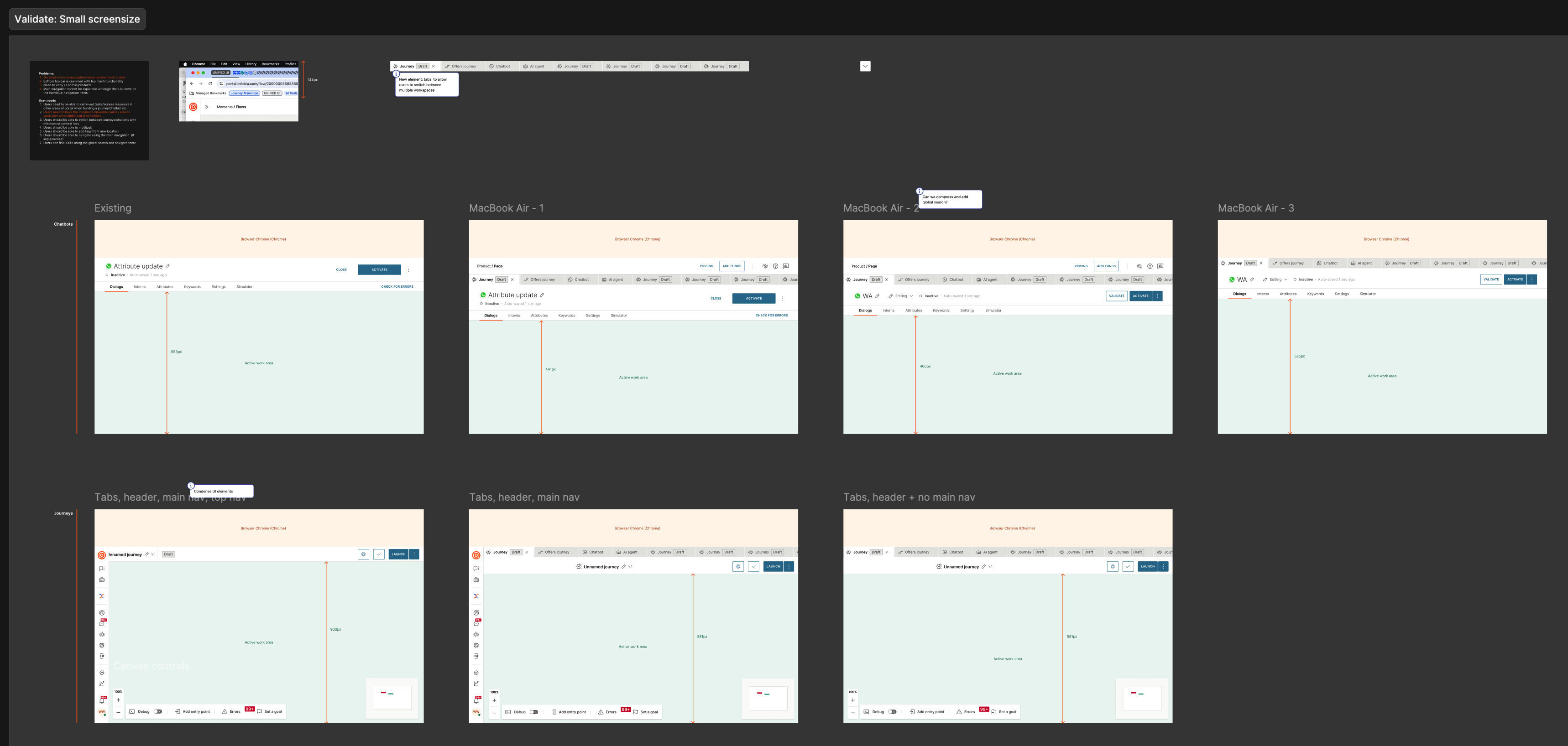
Validating the design against small laptop screens — comparing the existing UI with tighter breakpoints, testing tab/header/nav combinations to protect that cramped 460px of vertical workspace.
The solution
The redesign reworked navigation and information architecture so the two products felt like one continuous workspace, while reclaiming screen real estate:
- Removed Moments’ left-hand main navigation bar. Answers didn’t have one anyway, so removing it both unified the two experiences and maximised usable workspace.
- Introduced a global search function plus contextual links in the builder, so users could jump to what mattered without a persistent nav rail.
- Removed the Moments footer — which had become a “dumping ground” — and reworked its items into a shared build / test / launch / monitor lifecycle pattern common to both products.
- Introduced in-product tabs so users building cross-product experiences could move between the two products with clear, explicit context switching.
Amplitude showed 70% of users navigated out to other areas — so those paths were preserved through search and in-builder links, and validated in user testing.
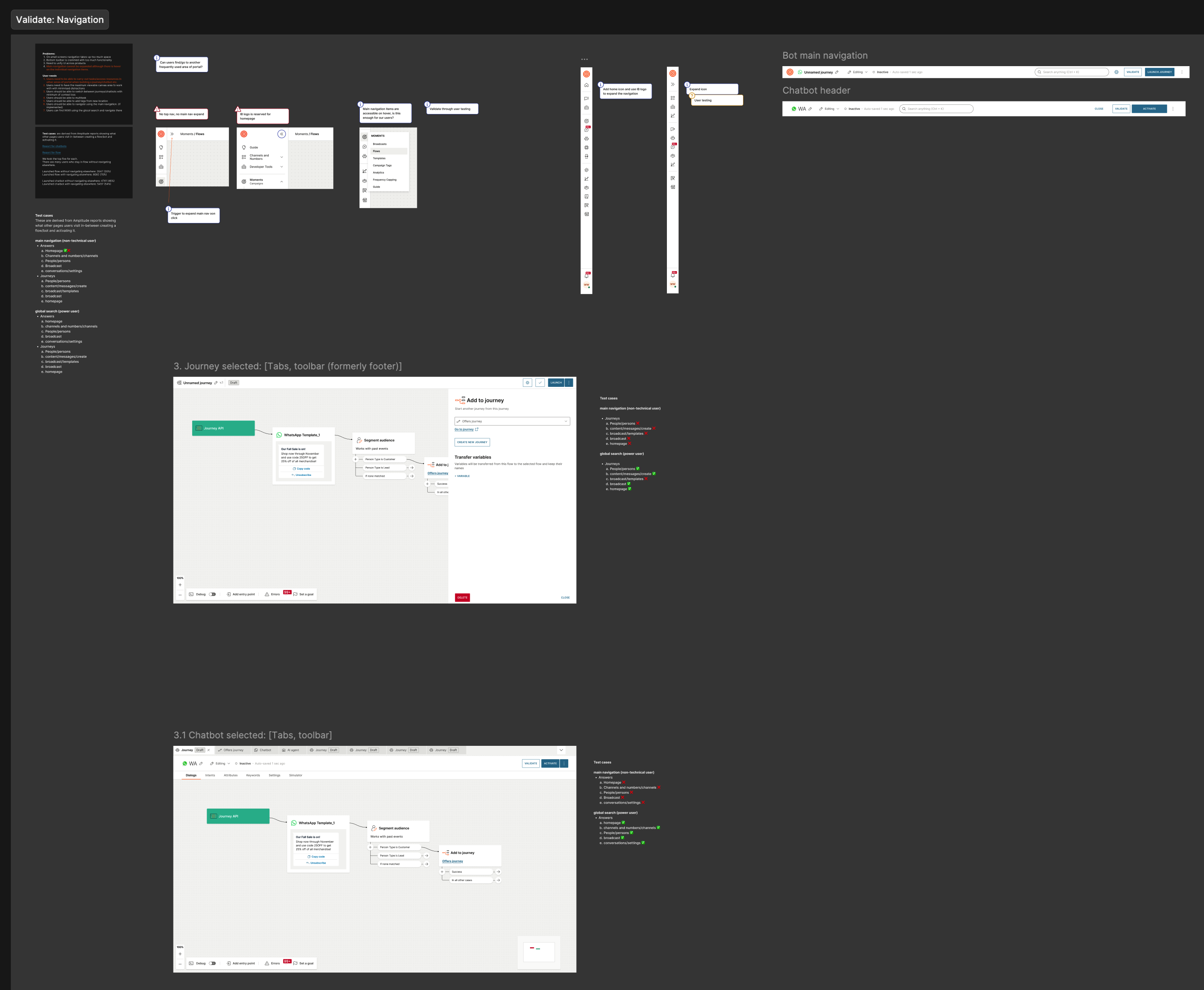
The reworked navigation model — a unified main navigation and header spanning both the marketing journey and the chatbot, with the left nav bar removed to reclaim workspace.
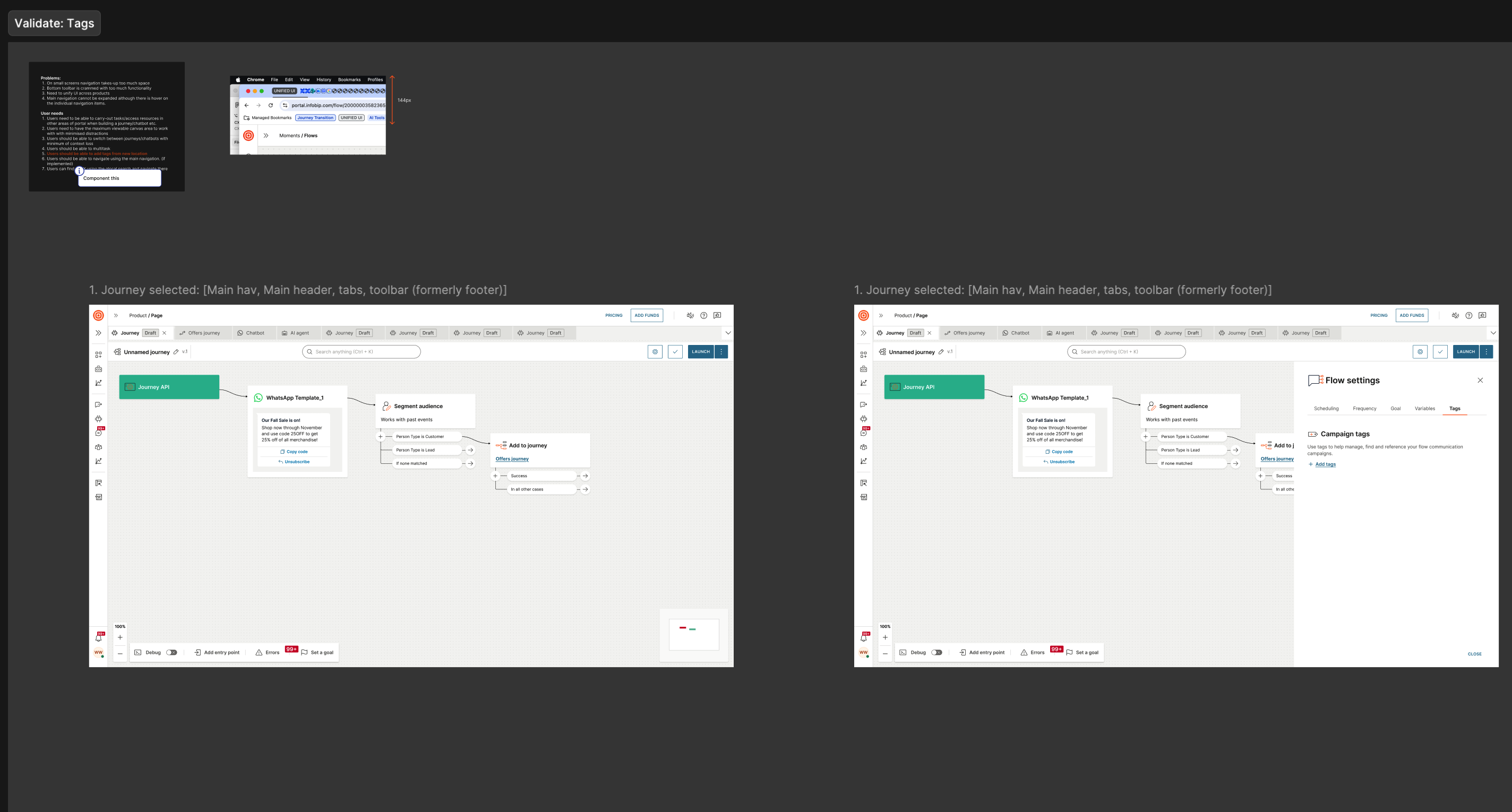
The unified journey view — main nav, header, in-product tabs and a toolbar (which replaced the old “dumping ground” footer), with flow settings and tags in a contextual right panel.
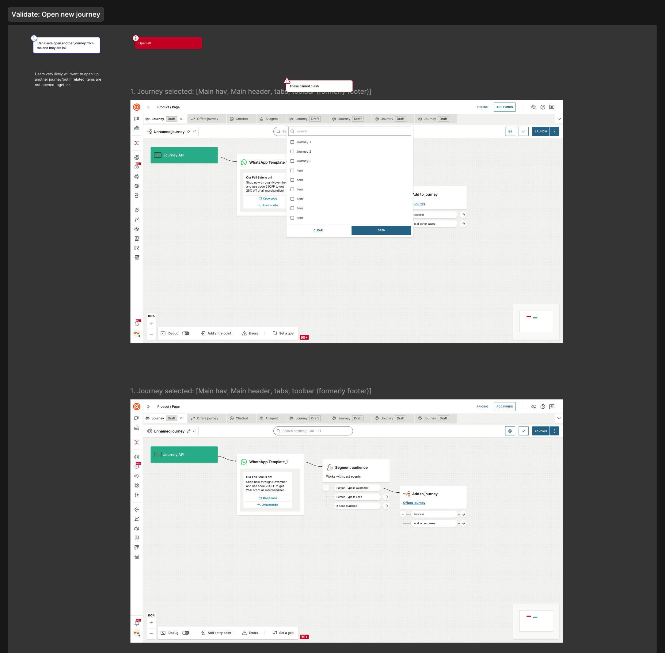
Global search and quick open-journey — the replacement for the persistent nav rail, preserving the paths that 70% of users relied on.
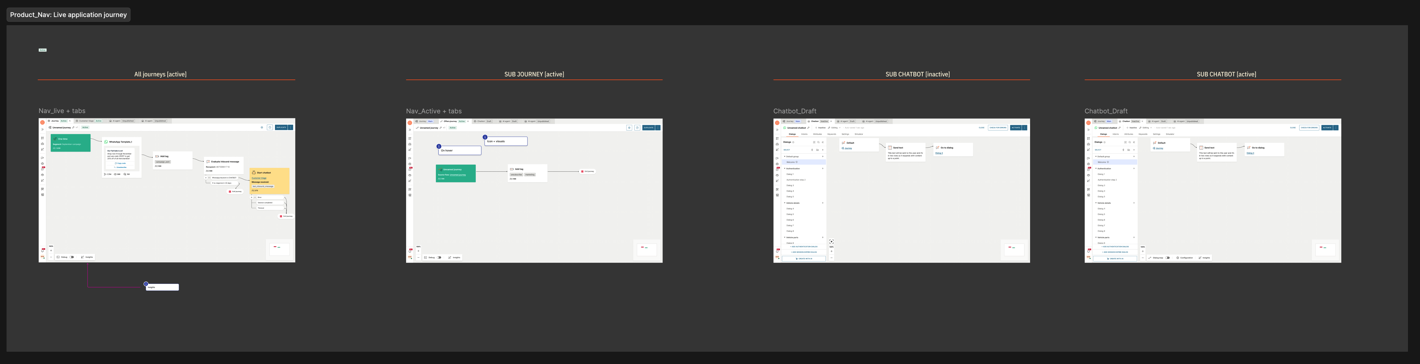
In-product tabs in the live application — explicit context switching between an active journey, a sub-journey, and the chatbot: marketing and service in one continuous workspace.
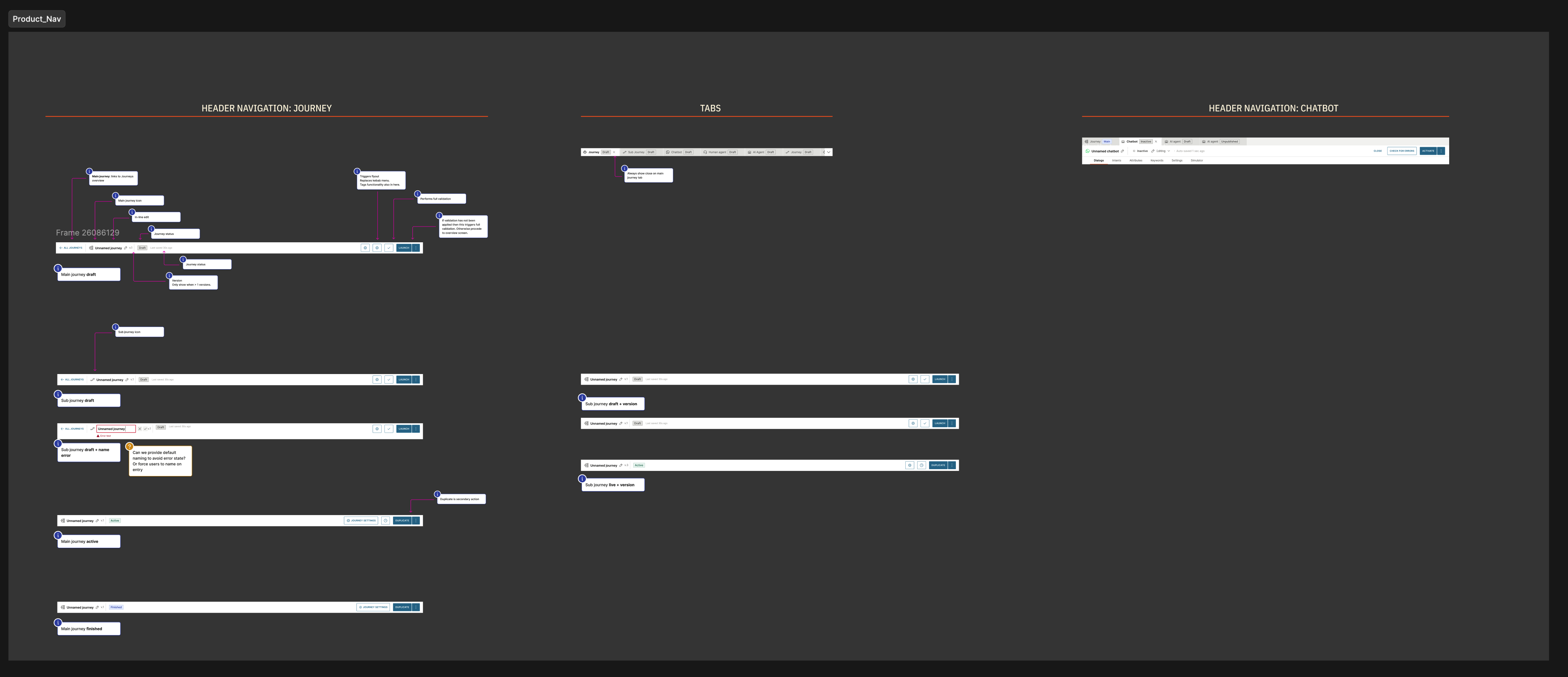
The navigation prototype — mapping every header-navigation state across journey, tabs and chatbot to prove the context-switching held together end to end.
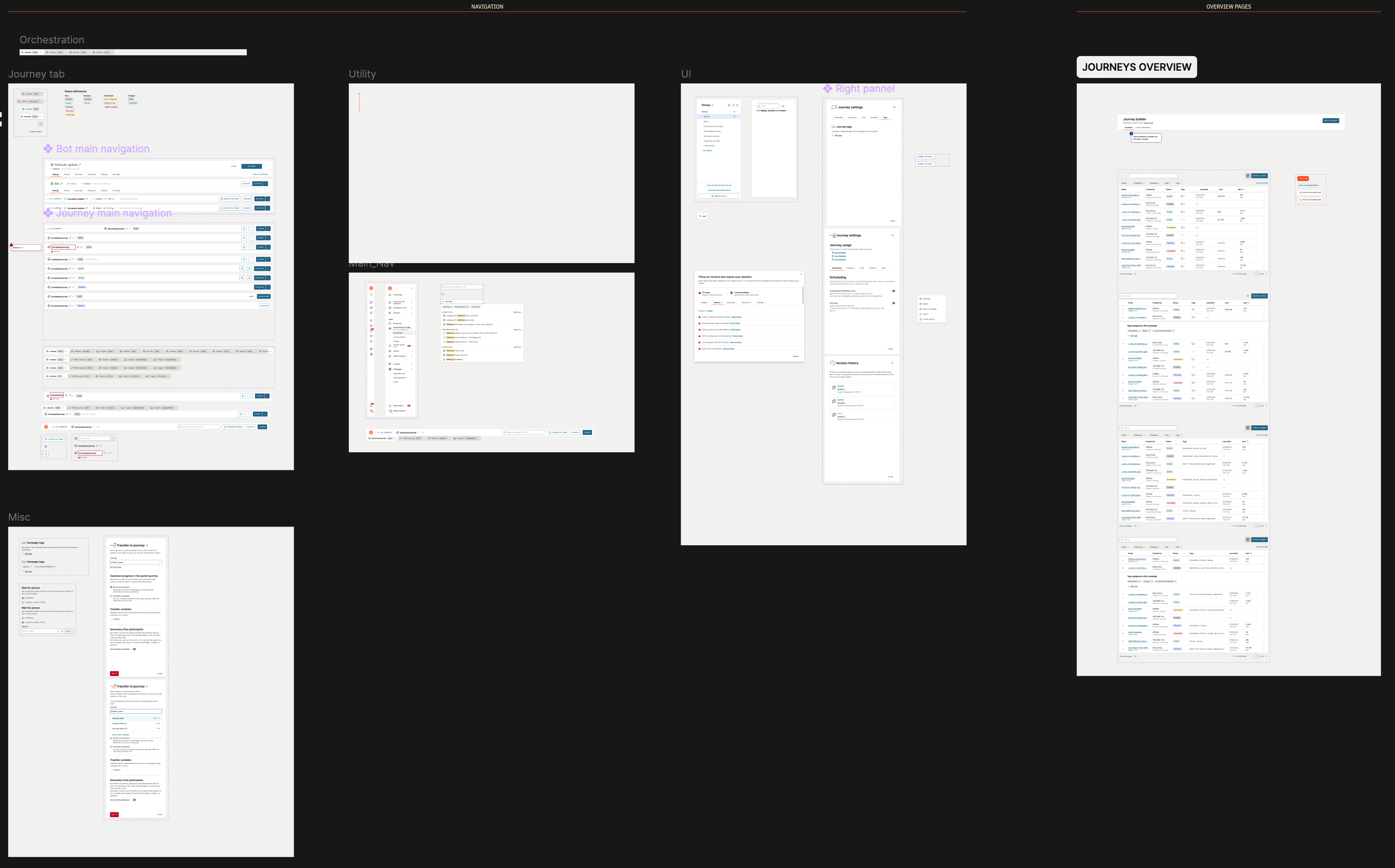
Orchestrating the whole picture — journey tab, utilities, UI patterns, the right panel and a full journeys overview, brought into one coherent system.
Overcoming pushback with evidence
Removing the main navigation bar meant changing a pattern owned by the design systems team, so this wasn’t a decision my project could make unilaterally — aligning with them was one of the most demanding parts of the project. There was significant pushback against changing the navigation behaviour. Rather than argue it on opinion, I made navigation a key focus of user testing, and the testing surfaced no problems with the new approach. That evidence was what carried the change through: the decision was settled by validated user behaviour, not by whoever pushed hardest.
Results & impact
- Delivered on time to the hard 1 April 2026 deadline — a genuine achievement given two mature products had to be reconciled in ~5 months under executive scrutiny.
- Positive validation from every audience — from user testing, and from internal users, partners and some clients.
- De-risked rollout — ran under a feature flag for a month before general release, allowing real-world monitoring and a controlled ramp rather than a big-bang launch.